

PROJECT INFO
Client: Chance-Non-Profit Animal Shelter wants a new and responsive website
MY ROLE
User Research
UX/UI Design
Interaction Design
DURATION
4 weeks (April 2021)
Throughout the COVID-19 pandemic, many businesses were severely affected, and nonprofit Animal Shelters are one of them. An essential process in animal adoption is going into the shelter to visit the animal to see if it will match, but this wasn't easy during the pandemic.
Chance Animal Shelter wants a strong and informative responsive website since in-door visiting is not available during the pandemic. Chance wants to provide users the most accessible journey when adopting or learning about their animals online. Unfortunately, its current website needs a change to achieve that goal.
.png)
How might we provide the same or better experience for users when adopting online than in person?
.png)
The new design will include
• Responsive designs to offer an optimized browsing experience
• Clean and accessible UX designs
• Animal Profile pages for better understanding of the animals
• Include features that can help guide users
• Research Plan
• Competitive Analysis
• 1:1 Interviews
• Persona
• Feature Roadmap
• Site Map
• User Flow
• Low/High Fidelity Wireframes
• Logo
• UI Kit
• Responsive Site Design
• Prototype
• Usability Testing
• Test Observation
Goals
• Understand the pain points and successes of an online animal shelter website
• What are animal adopters looking for in an online animal shelter website?
• What are the habits of animal adopters while using an online animal shelter website?
• What are some efficient and helpful features I can add?
Methodologies
Competitive Analysis (Research on the competitors)
Market Research (Observe the locations and demographics)
1:1 Interview (Speak to individuals directly and ask about their thoughts and wants for animal adopting)
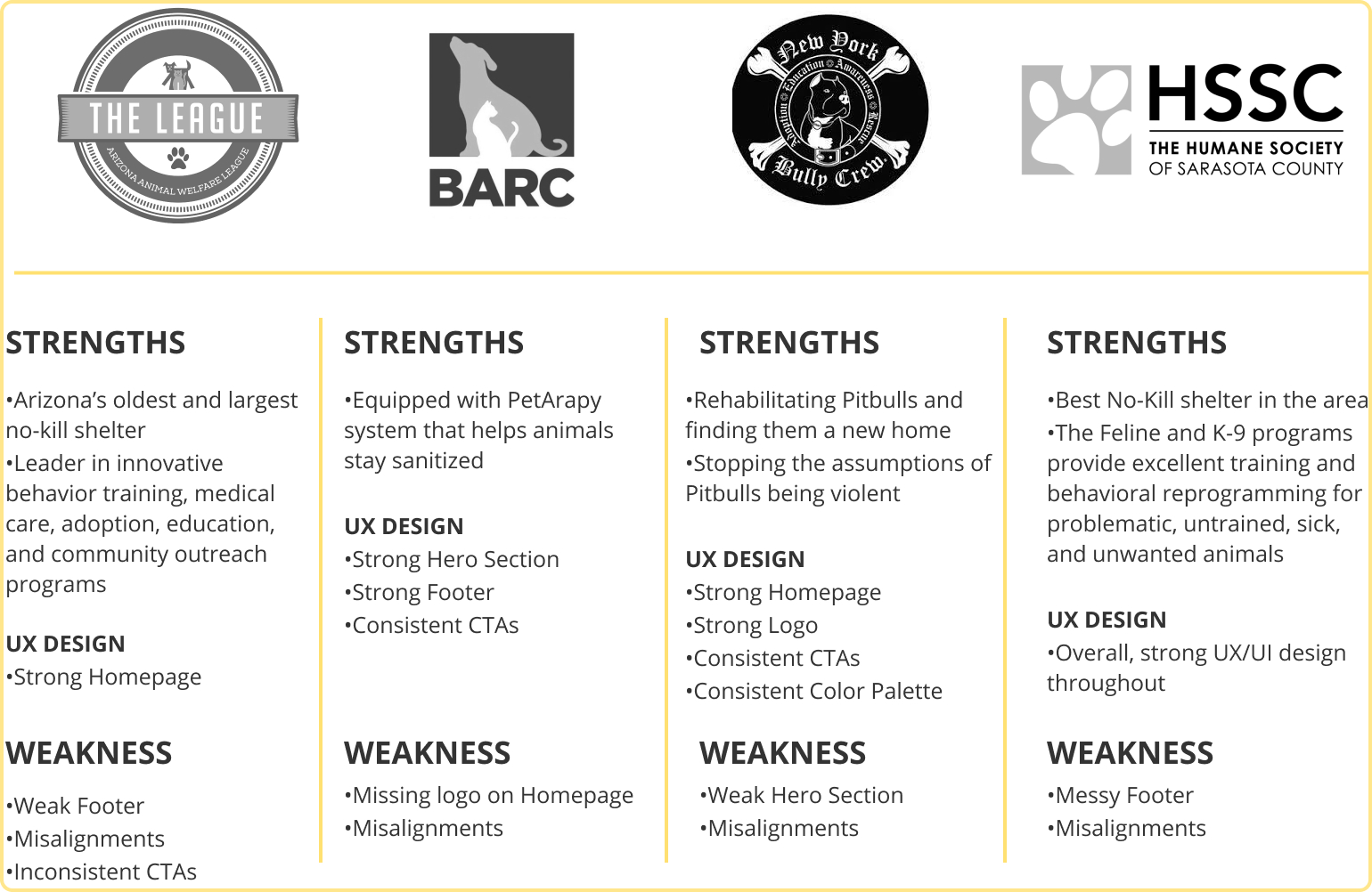
I began by doing some research on other animal shelters. I have noted down their strengths and weaknesses after my first-hand experience on each website.

PARTICIPANTS
7 Participants
Age 24-28
NEEDS
• A matching pet quiz
• Well thought brand aesthetics
• Precise animals sections with filters
• Online Live Chat Service
• Lots of images or short clips of animals
• Lists of previously adopted animals
• Higher exposure of their Social Medias
• A step by step guide of how to apply to adopt animals
• More background information of the shelter, animals, and staffs
•More information about the food/environment that is provided for the animals
• Medical histories and the veterinarian of animals
• An online calendar that provides the most up to date events and news
FRUSTRATIONS
• Wants review section but not trust the liability
• Not enough adopting information online
• Not transparent
• No guidance to adopting process
• Not enough exposure through online services
• Not enough information about animals/shelters/staffs
Based on the 1:1 interviews, I've decided to created two Personas to show the different types of users that may visit animal shelter websites. One can be a current animal owner, and the other can be someone new to adopting animals.


A list of prioritized features help guide what features I should add to my designs. This feature list is created based on information from previous research, and I have categorized them into three phases: must-have features and features I can include later on.


With the help of my feature list, I created a site map. The site map is beneficial as an overall structure for my design. It includes all the essential elements I will need to include in the screens that I will be designing.

This user flow outlines the task and decision a user faces while completing their given task in the usability testing. This process flow is important because envisioning all the steps in one diagram helps provide a bird's-eye view of the overall design/product.
The Site Map and User Flow helped me understand what screens and element interactions I'll need to design. And from that, I have made four main low fidelity wireframes to allow the users to complete the task during the usability test.

Before jumping into high fidelity wireframe design, I designed the new logo for the brand and created a small UI Kit of all the important UI's. Creating a design system is beneficial because it can help save time and achieve consistency in a design.


Average completion time: 1 minute
Participants: 7 people
Given Task: After landing on Chance's homepage, find and add two dogs (a Golden Retriever and Shiba Inu) to your favorites page and make sure it's added.
Commonalities
• 7/7 finds it easy to use
• 7/7 completed the task
• 6/7 used the Navigation Menu to search
• 7/7 used filter to sort their results
• 6/7 enjoyed the 'Animal Profile Page'
• 5/7 favorited the animal on the 'Search Result Page'
• 7/7 clicked on heart icon to get to 'Favorite's Page'
Since everyone completed the task and the positive feedbacks from users during the usability testing, not many iterations are needed. Though no pain points are coming from users, I still went back to review my design and find things I can iterate on.
Iterations include:
• Responsive wireframe designs (spacing was off on previous designs)
• Selecting better color choices (for buttons and background colors)
• Work on the hierarchy of each screen
• Header/Navigation Menu and Footer design
• Prototype (smoother flow)

Throughout this journey, I can get absorbed into specific design sections, stopping me from looking at the big picture. Picking out the perfect image or finding the best color palette does not provide users an accessible website. And knowing that it will only prevent me from moving it, I took a step back and reinvestigated the main goal and solution I am trying to develop.
What I would do differently next time
Instead of being caught up with specific sections, I would move on or work on other deliverables. Not pulling out when you're stuck will only waste more time and cause more frustrations.
.jpg)
.jpg)


