
CLIENT
Mirror Shopping Company
MY ROLE
Research, Interview, Task & User Flows, Logo & Icons, Wireframe, Prototype, Responsive Web design
DURATION
4 weeks (March 2021)
ABOUT THE CLIENT
Mirror is a clothing brand that started in 1994. Its primary target audience is a wide range of people. Mirror’s goal is to make clothing accessible for everyone and believes that fashion changes all the time, and Mirror yearns to make that easy for customers.
Mirror’s offline service is very well operated, but it wishes to boost sales, and due to the benefits of online shopping, it hopes to shift its direction and into e-commerce.
SCOPE AND FOCUS
•Online e-commerce shopping sites are becoming more prosperous.
•Mirror’s current website is very outdated and lack background about the company.
•Mirror desire to have a more informative and accessible responsive website
SOLUTION
•Accessible Responsive website
•Shopping with a smooth flow
•Allow the user to understand the brand
Research Plan
Competitive Analysis
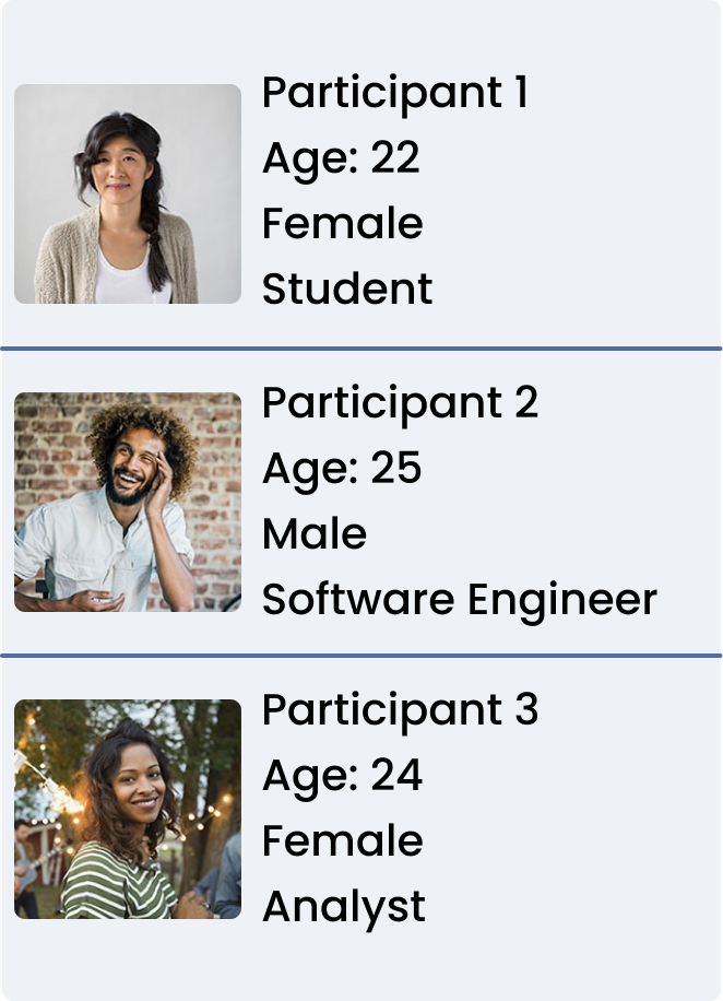
Interviews
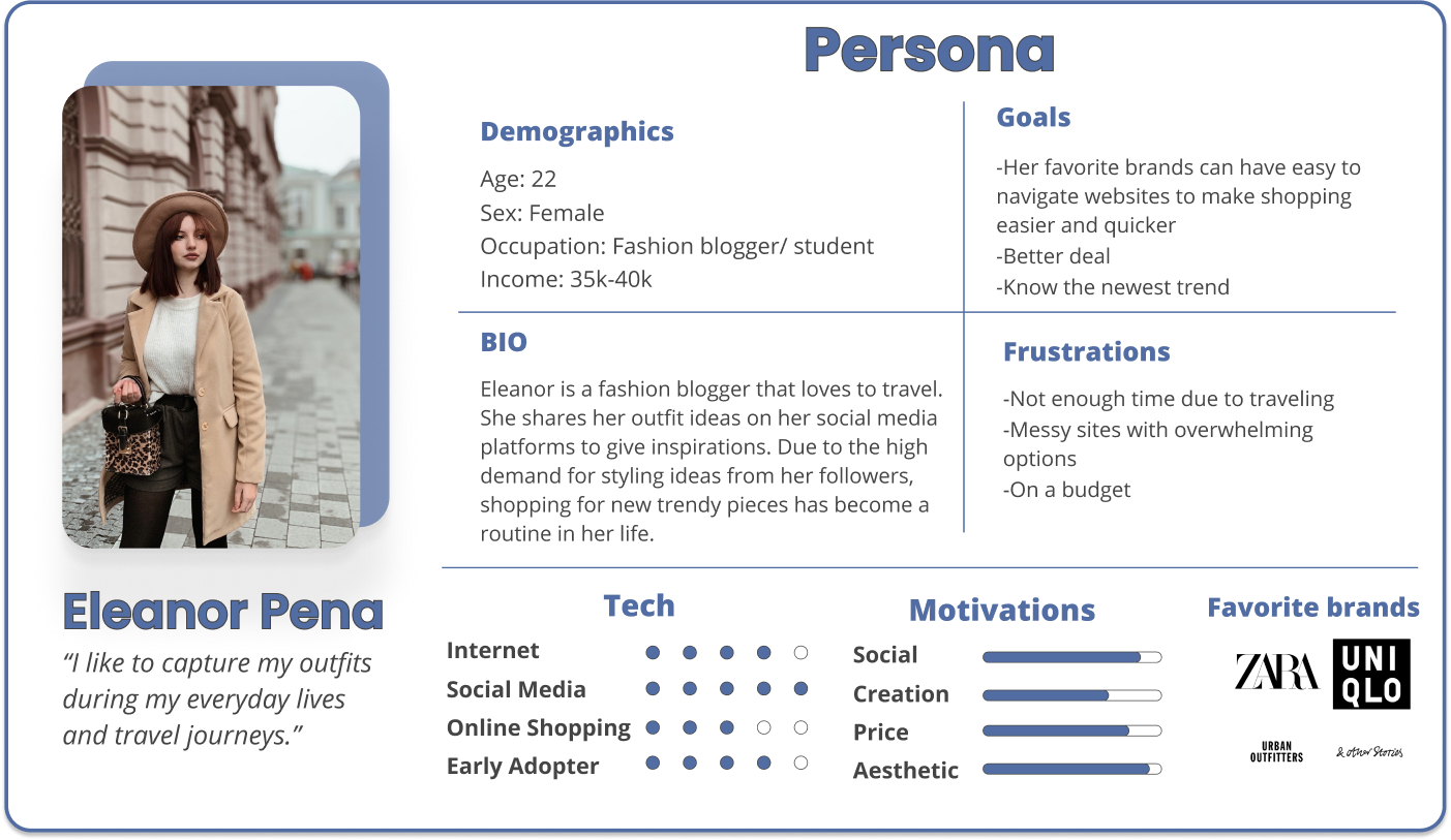
Creating a Persona
Card Sorting
Site Map
Varying Content
Task Flow
User Flow
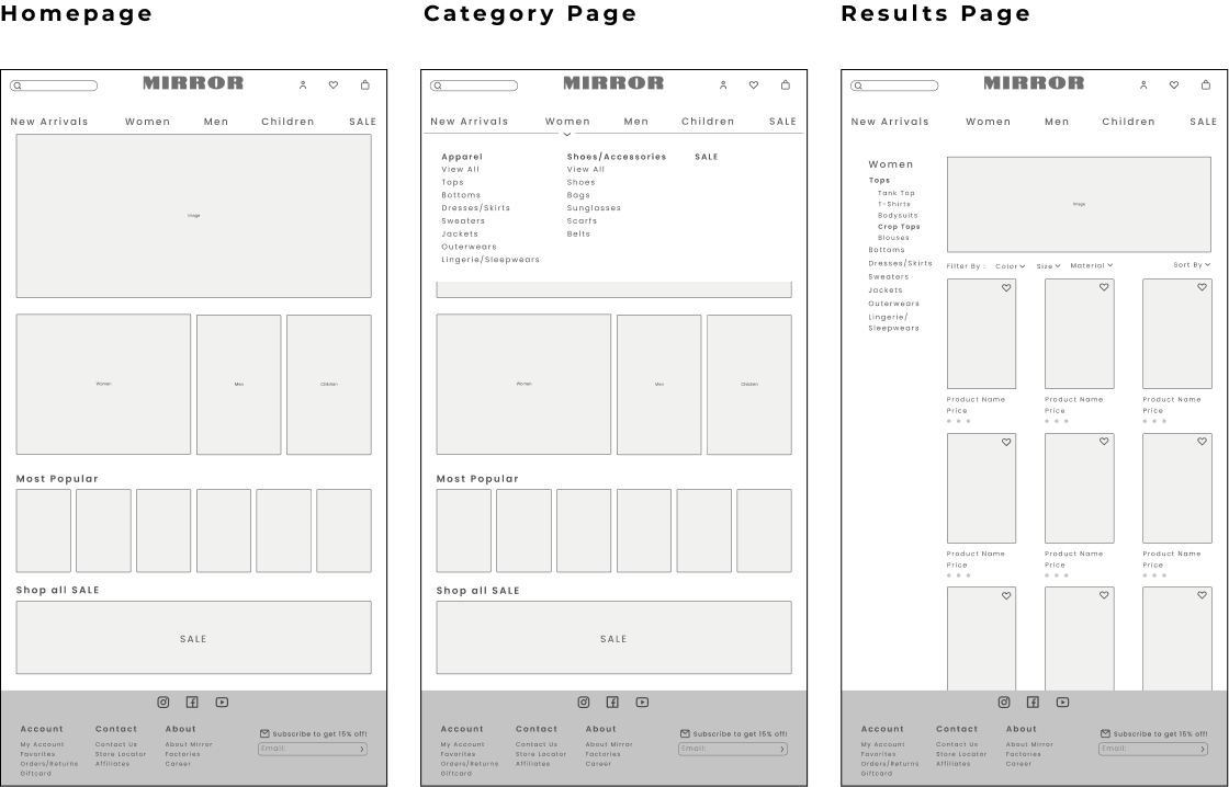
Wireframes
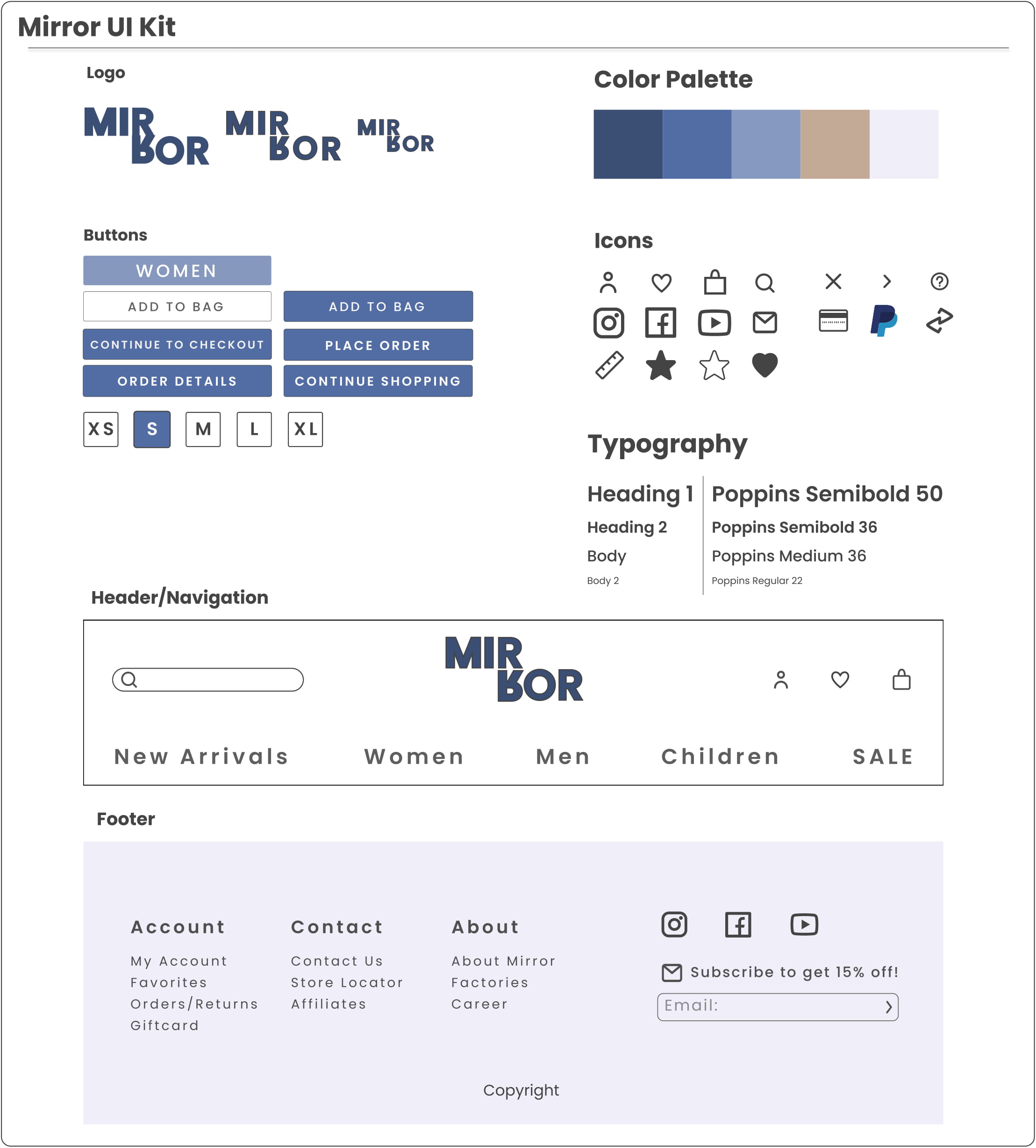
Logo
UI Kit
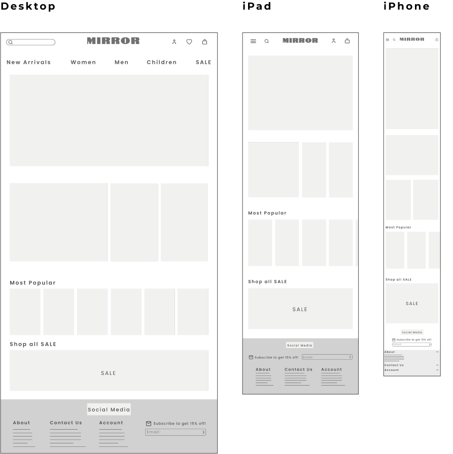
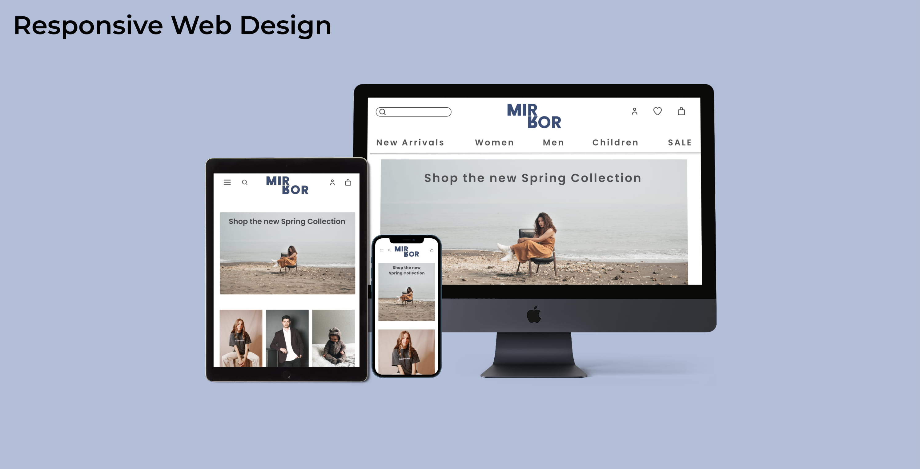
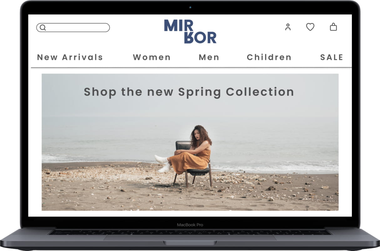
Responsive Site Design
Prototype
Usability Testing
Test Observation
Affinity Map
The research aspires to find the online shopping patterns of users and their thoughts while shopping.
1. Understand users point of view on e-commerce
2. Identify and observe customer’s pain points while using the site
3. Give users shopping tasks and monitor the whole process
4. What are essential factors that customers like and dislike
Goals
•Less time consuming both online and offline
•Returning can be more hassle-free
•See the good and bad side of fast fashion
•Well thought brand aesthetics
•Precise clothing sections
Frustrations
•Having to go back to store to return
•Not being able to try on clothing while shopping online
•When website design and product page are too messy
•Online shipping packagings can be wasteful
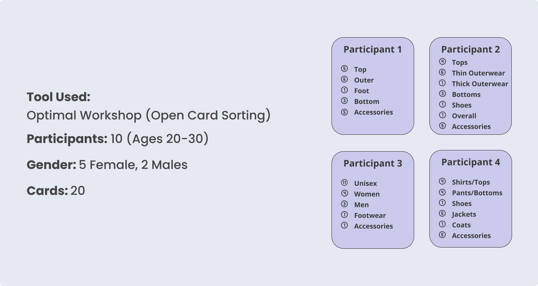
Findings:
•Different people can categorize the same item so uniquely
•Separating clothing item by seasons
•Separating clothing by their preference in style
•Different names for the same category (Tops-Shirts, Accessories-Jewelry)
•Some participants are more specific with categorizing
•The most common are Tops, Bottoms, Jackets, and Accessories.
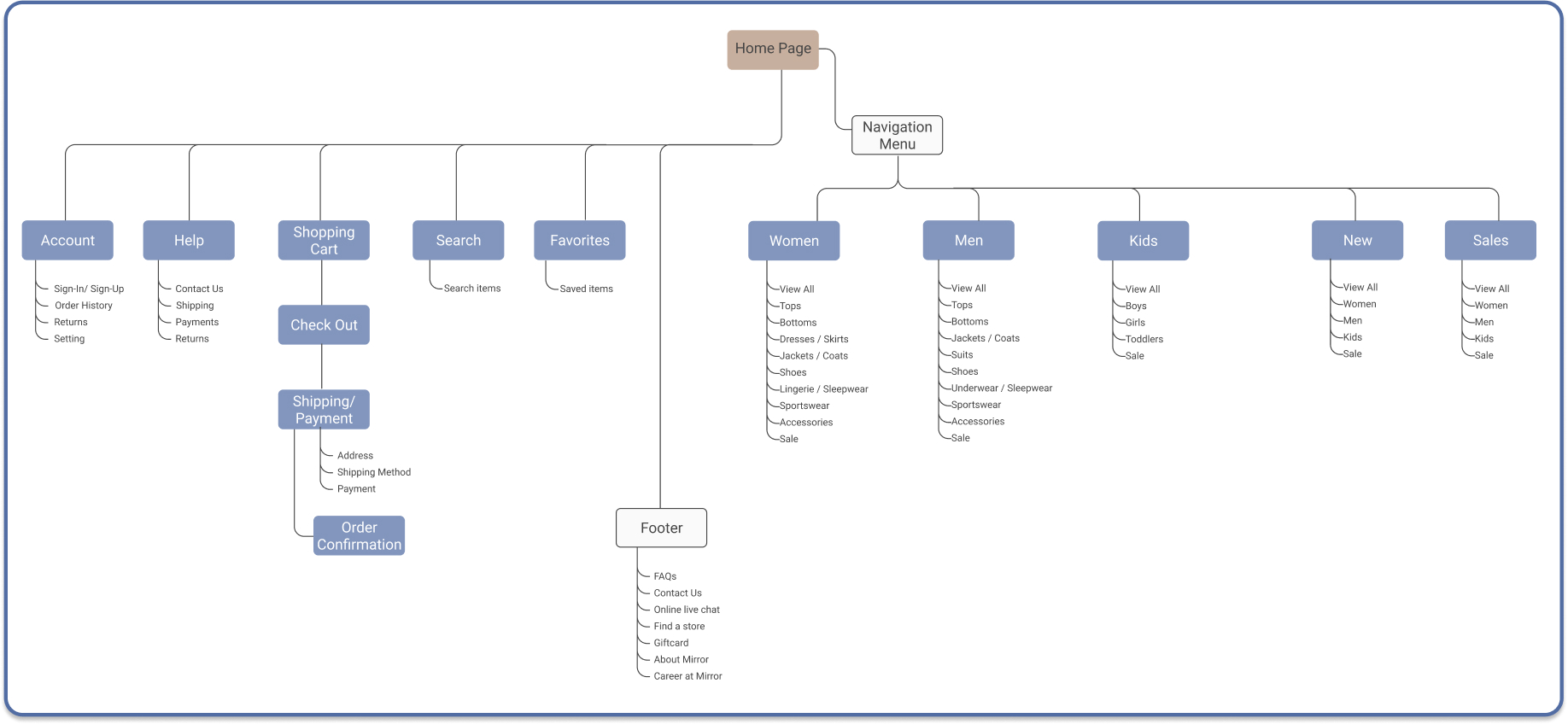
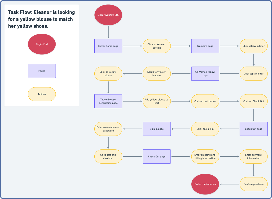
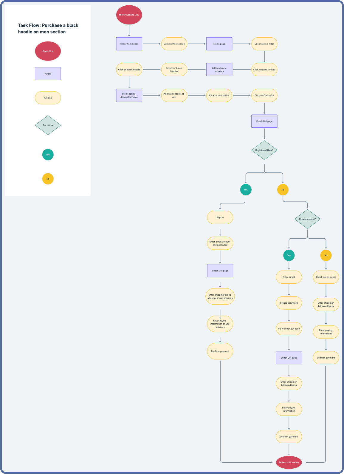
Based on the Site Map and Card Sorting, I created a Task flow and User Flow to map out the shopping process of what a user will go through when purchasing an item.
Click on the screen above to bring you to the interactive prototype made on Figma.
Average Time : 59 seconds
Commonalities
•5/5 finds it easy to use
•5/5 completed the task
•2/5 started their route by clicking on the Women CTA
•3/5 started their route by clicking on Women on the Navigation Menu
•3/5 used the filter to sort out the results
•2/3 liked the Added To Cart drop down
•5/5 clicked on cart icon to get to cart page
Others
•0/5 started their route with search bar
•1/5 wanted to use PayPal
•1/5 clicked on Continue Shopping after finishing their purchase
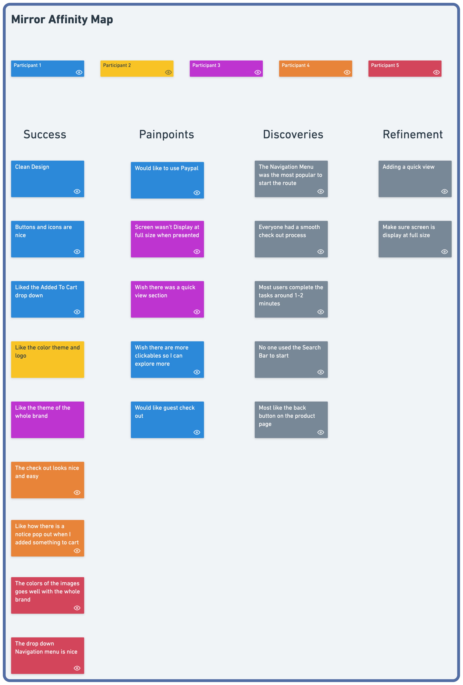
An Affinity Map is created from the observations made during the Usability Testing.
Lorem ipsum dolor sit amet, consectetur adipiscing elit. Suspendisse varius enim in eros elementum tristique. Duis cursus, mi quis viverra ornare, eros dolor interdum nulla, ut commodo diam libero vitae erat. Aenean faucibus nibh et justo cursus id rutrum lorem imperdiet. Nunc ut sem vitae risus tristique posuere.
.jpg)
.jpg)
.jpg)